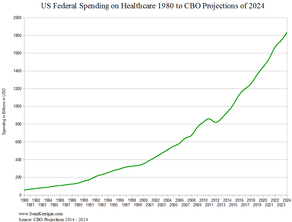
In 2012, I created this chart, which mapped out US federal government spending on healthcare from 1960 to the Congressional Budget Office’s projections up to 2022, which was the most recent data they had available at the time. For a while now, I’ve wanted to update that chart to address some criticisms people had.
First, I wanted to see if there had been any changes in the overall trajectory of the spending. There is only one direction this graph can ultimately go and that is down, at which point we will have a very serious economic situation, probably one more serious than anybody living has ever witnessed.
The progressive left thinks the CBO has an interest in making the budget look as bad as possible so the government could push for unpopular austerity on the poor and middle class. In addition, they don’t think debt matters. Based on the past spending curve, I believe the governments figures are accurate, and that these numbers are big enough to matter. While it’s too early to say for certain, so far the updated graph shows the situation worsening, just as the CBO has predicted.
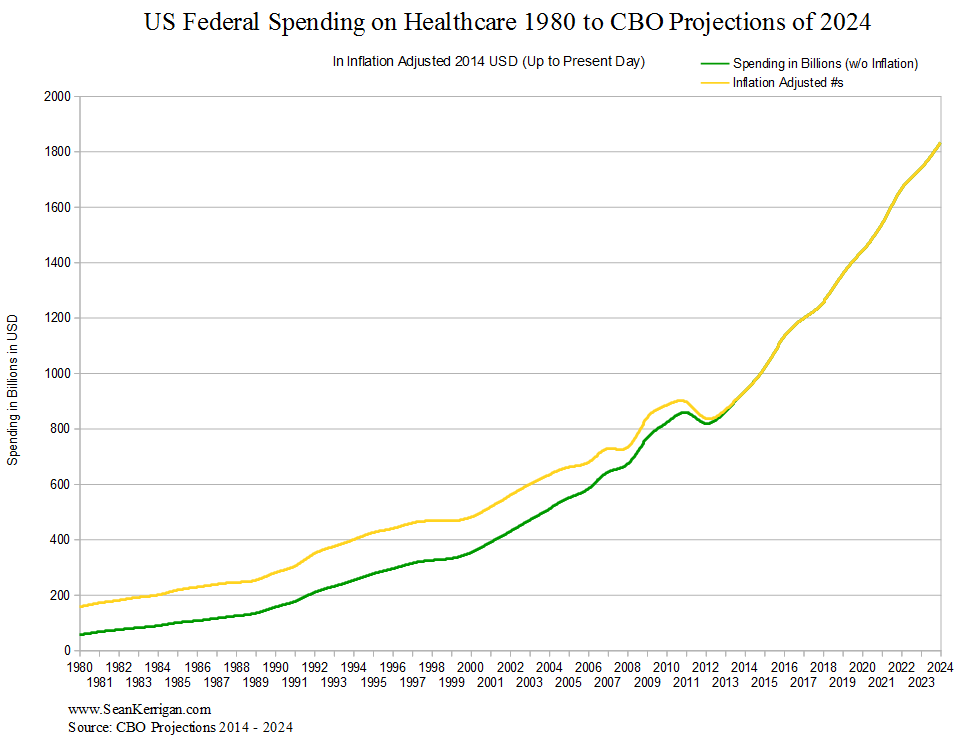
Second, I wanted to address the criticism that my original graph was not accounting for price inflation, and that on a long enough time line, you could make the price of anything look unsustainable. I knew instinctively this was not the case, since the rate of price inflation is far lower than the rate of increase for healthcare spending (which averages about 9 percent for the first half of the graph, and about 6 percent for the second half).
This was a time consuming task, but I’ve finally created this composite, which overlaps my new figures with the inflation adjusted ones. Below in yellow you will see the figures if they were adjusted for inflation using 2014 dollars. There is no significant change. In short, the growth is exponential and by definition, a catastrophe waiting to happen.
To put this graph into some perspective, they want us to believe that by the early 2020s we will than double the amount we spend on healthcare. Since we currently spend about as much on healthcare as we do the Pentagon, it would be like funding a whole second military.
In 2012 I said:
The government cannot pay those benefits without seriously devaluing the currency. Commentators that say that austerity is unnecessary or worse yet, that we can tax the rich to get out of this are either ignorant of the problem or they are lying. Politicians who say “we’re not going to touch your Medicare” are also lying.
…When government spending collapses, so too will demand. It doesn’t matter how many Boomers need medical care, the money to pay for those services isn’t there. Without demand, the industry will hemorrhage jobs. A near permanent hiring freeze will result. Wages for surviving employees will be cut dramatically. Again, while things look perfectly normal now, when government spending evaporates, so too will jobs in the industry.
I still believe this to be the case. If the law says one thing and the math says another, it will be the law that ends up changing. In real terms the amount being spent on medical care by the federal government must come down. We probably won’t reach the end of this graph before that happens. It’s just a matter of when and under what circumstances.
If you want to view the raw data, you can do so here.


